SPONSORED CONTENT
By the Benjamin Moore Color Marketing & Development team
Anyone who has ever taken the journey to selecting the “just right” paint color for a room has heard the terms “warm” and “cool” colors. But what do these terms really mean, and how will they impact the feeling of your room once the color is on the wall?
What are Warm & Cool Colors?
Every color can be categorized as either a warm color or a cool color.
Warm colors
Warm colors include yellows, oranges, reds, and are popular for setting an upbeat, positive tone.
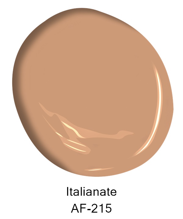
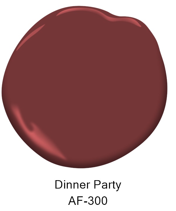
Some favorite warm colors include: Mannequin Cream OC-92, Muslin OC-12, Shaker Beige HC-45, Hawthorne Yellow HC-4, Italianate AF-215 and Dinner Party AF-300.
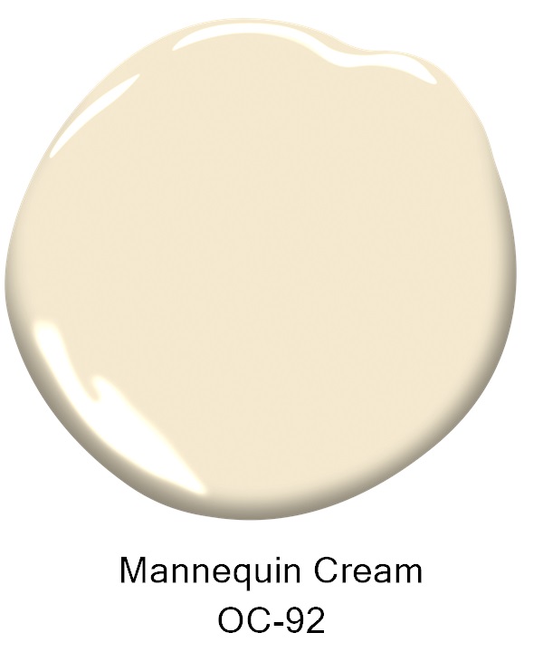
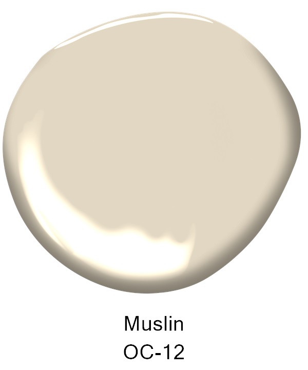
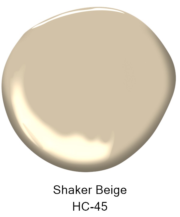
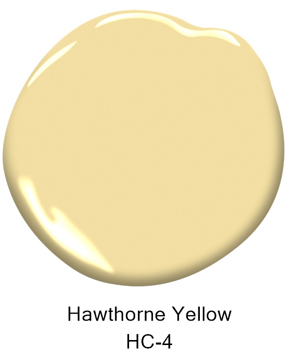
Warm colors are synonymous with sentiments like cozy and intimate, and are popular for use in living rooms and kitchens. They are often associated with energy, playfulness and happiness and are used to make larger spaces feel more inviting.
Cool colors
Greens, blues and violet-purples bring a calm, relaxing sensibility to a space.
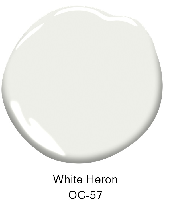
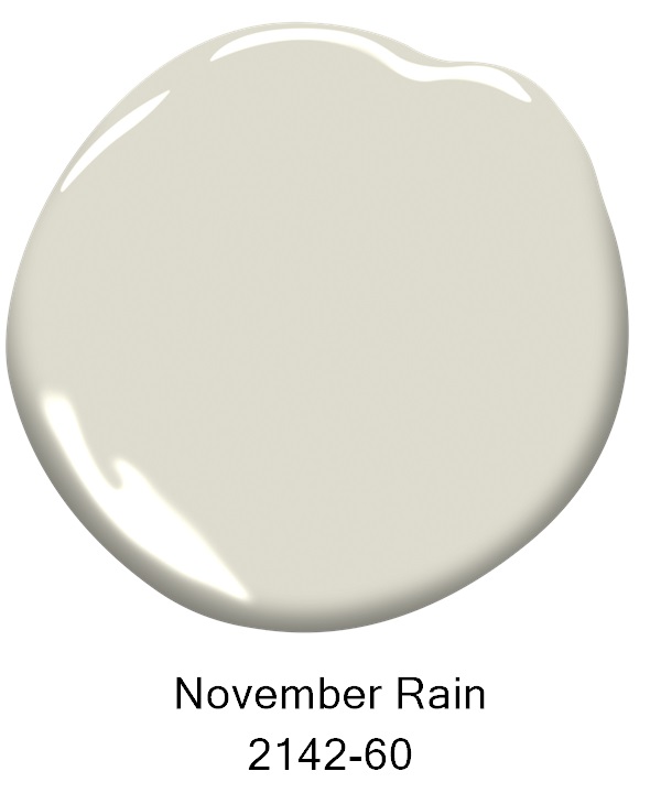
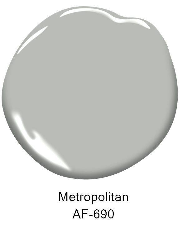
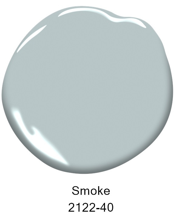
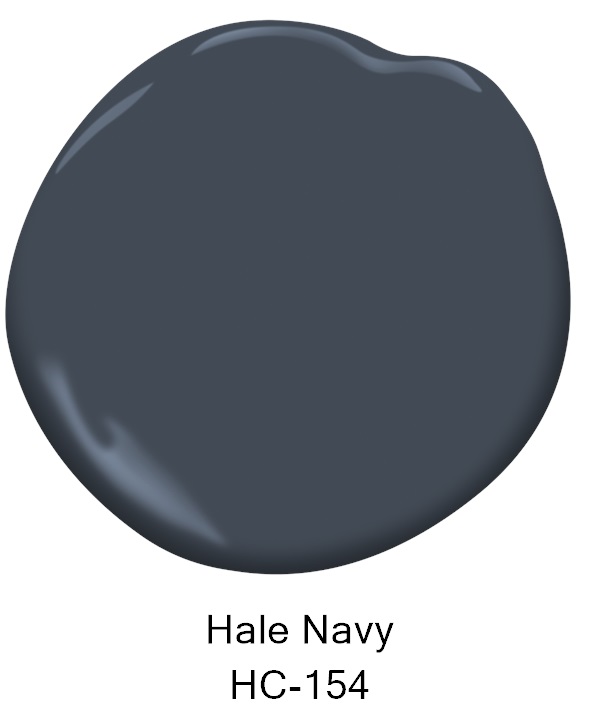
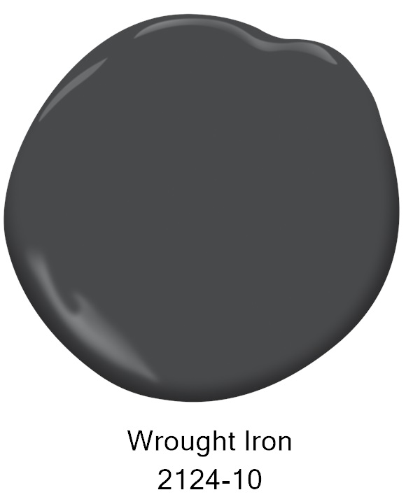
Some favorite cool colors include: White Heron OC-57, November Rain 2142-60, Metropolitan AF-690, Smoke 2122-40, Hale Navy HC-154 and Wrought Iron 2124-10.
Cool colors are often chosen to create a sleek, yet soothing vibe and are synonymous with calm, relaxation and freshness. They are popular for use in bathrooms and bedrooms and can be used to make smaller spaces feel more expansive.
Neutrals
Variations of white, gray and beige are always super popular paint color choices for homeowners. A thoughtful study of any neutral color’s undertone is essential to understanding whether the neutral in question leans warm or cool.
Designers often use both warm and cool colors in the same room. Keep in mind that the dominant color—whether it is warm or cool—tends to be the main influence on the room’s personality.
Embrace the Light
Lighting conditions are always essential to viewing paint color in a room to see whether the color reads warm or cool. Factors like natural lighting conditions, the time of day and artificial lighting influence whether a color appears cool or warm.
To take the guesswork out of warm and cool colors and how they will impact your room’s style, brush on a paint sample and observe it in every lighting condition is the best way to ensure a “no surprises” paint color choice. It is recommended to paint on a poster board, versus on a wall, to easily move the paint color around the room throughout the day.
Color selection can be quite an in-depth process but there are several resources and color tools available to help in the process. In addition to pint-size paint color samples and color swatches, the Benjamin Moore Color Portfolio app and ColorReader can also help simplify color selection and visualize colors in spaces. Learn more at benjaminmoore.com.
Post courtesy of the Benjamin Moore Color Marketing & Development team.