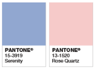
 Bringing the year to a beautiful end, PANTONE has announced its 2016 Color of the Year–and for the first time, it’s a blending of two shades, Rose Quartz and Serenity.
From the PANTONE website:
“As consumers seek mindfulness and well-being as an antidote to modern day stresses, welcoming colors that psychologically fulfill our yearning for reassurance and security are becoming more prominent.
Joined together, Rose Quartz and Serenity demonstrate an inherent balance between a warmer embracing rose tone and the cooler tranquil blue, reflecting connection and wellness as well as a soothing sense of order and peace.
The prevalent combination of Rose Quartz and Serenity also challenges traditional perceptions of color association.”
We can’t wait to see how these, and other, colors are used next year!